
All website owners are on the hunt to get more engagement on their site. For this, people use many methods. One of them is adding animated visuals. Although movement and vibrant colors catch the eye more quickly than flat images, moving creatives can also increase load time.
If you plan to increase engagement on your site with visuals, it is advised to work with expert creators like AnimatedVideos.co. We know the right size, length, and placement for loading visuals on your site.
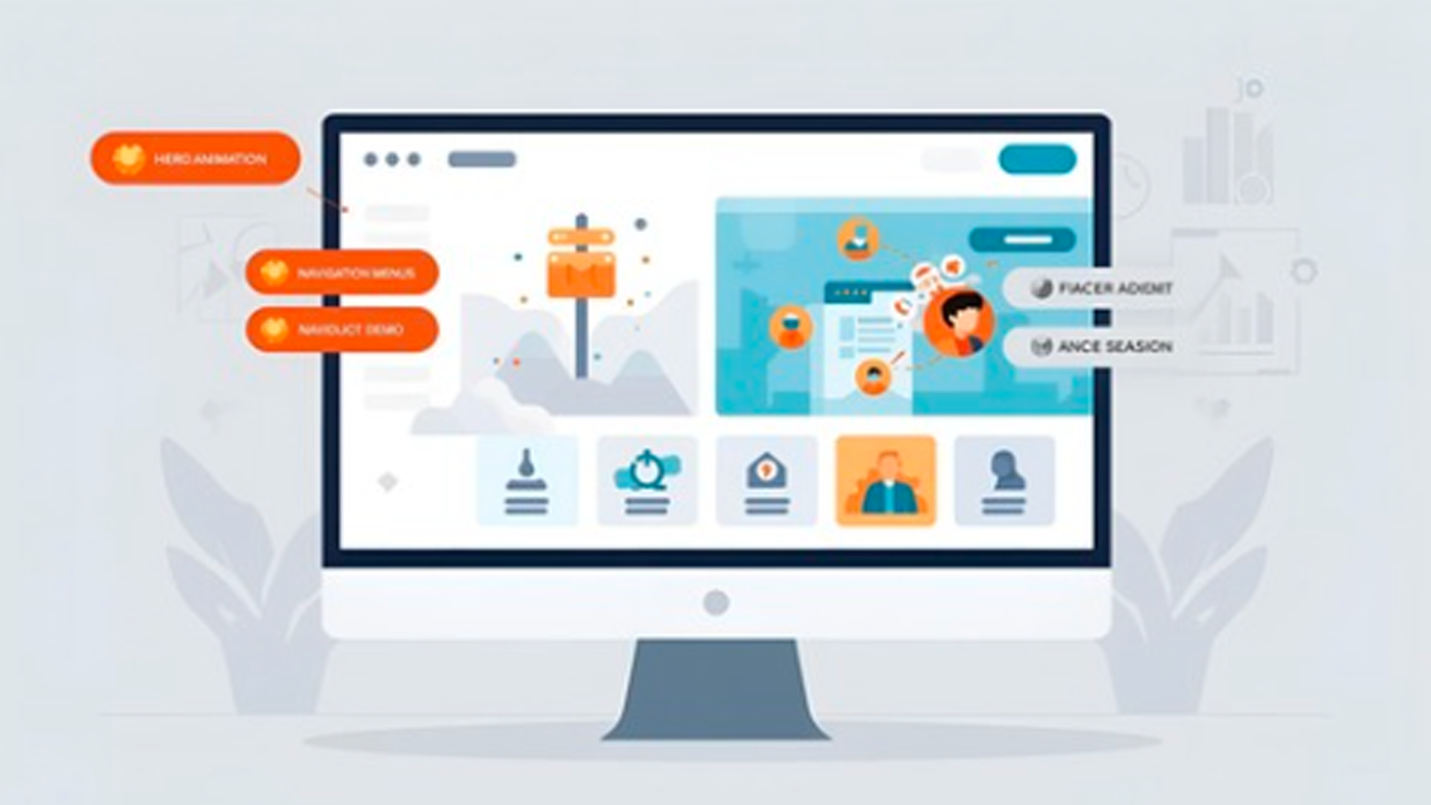
Why Use Animation On A Business Website?
Animation signals action. It shows progress and confirms results. A micro-interaction on a button tells users a click registered. A subtle reveal directs attention to the next action.
Well-crafted motion increases satisfaction and can improve conversions. Research on micro-interactions and dynamic UI shows measurable gains in engagement and retention when motion is used with purpose.
Use motion to answer questions a user might have before the user asks them. Use motion to make the interface feel alive, not noisy. Keep performance in mind. Slow motion negates the benefits of good design.
What Animation Belongs In The Hero Section?
Hero animation should do two things: create a clear first impression and highlight the primary offer. Use short, looping micro-animations for focus. Animate one element at a time, such as a headline reveal or a soft parallax on a product mockup. Keep complexity low so load time stays fast.
A hero animation that supports brand identity can increase recall. Studies on animated logos show motion that matches brand cues strengthens recognition and emotional response. Use motion to signal the brand personality, not to steal attention from the core message.
Where Should CTA Buttons Use Animation?
Call-to-action buttons need motion that nudges action. Small hover effects, a brief pulse, or a micro-shift on scroll are highly effective. These animations should be quick, subtle, and confined to the interactive element.
Avoid continuous or flashy loops on CTA elements. Subtle motion reduces choice friction. Test a micro-animation in an A/B test and measure click-through change. Data often shows modest animation changes can lift conversion rates by meaningful margins.
How To Use Animation In Navigation And Menus?
Navigation benefits from motion that clarifies structure. Use slide-ins for mobile menus, fade reveals for dropdowns, and a small focus indicator for the active item. Motion should happen fast and predictably.
Avoid long easing curves and heavy content shifts that confuse the visitor. The navigation must load first and respond instantly. Any delay here damages usability.
When To Animate Product Or Service Showcases?
Animation helps demonstrate function. Use animated mockups, short explainer loops, or guided scroll reveals to show how a product works in real time. Motion is especially valuable for services that are abstract or difficult to explain with text alone.
File size discipline matters. Swap heavy videos with compressed animations or optimized SVG motion. Lightweight formats like SVG or short MP4 clips maintain speed without sacrificing impact.
3D assets can be powerful, but they require careful planning. Always weigh 3D animation production costs against the expected conversion lift. Anchor the decision to measurable results and budget so the investment supports business goals.
How Should Forms Use Animation For Feedback?
Forms must communicate status clearly. Use motion to confirm success, highlight errors, and guide corrections. A gentle success tick, a text fade-in, or an error shake draws attention without frustration.
Do not use animations that block user inputs or hide messages. Keep feedback immediate and persistent until the user sees it.
Are Loading Animations And Page Transitions Useful?
Loading states reduce perceived waiting time. A compact progress indicator or skeleton screen keeps users on the page. Smooth transitions maintain visual continuity between pages.
Limit transition length to a fraction of a second. Slow transitions cause abandonment. Always test load states on slower mobile connections.
Use loading animation to improve perceived speed, not to mask real performance problems. Page speed matters for SEO and conversions. Aim to stay under three seconds for the initial load.
Where Should Animation Not Be Used?
Background Overload
Background loops and large video canvases often distract from the message. They add weight to the page and increase load times. Avoid decorative background motion that competes with copy and CTAs.
Core Content Areas
Core text and important data must remain readable and stable. Avoid auto-playing carousels and constant motion in content areas. Motion that makes reading harder reduces comprehension and trust.
Critical Navigation Paths
Do not add animations that slow down or block crucial actions, such as checkout flows or important form submissions. Motion that delays user clicks or obscures status leads to abandoned carts and lost leads.
Mobile-Heavy Pages
Mobile traffic dominates most business sites. Heavy animations can kill performance on low bandwidth. Avoid large scripted animations on pages designed for mobile.
Use CSS-only motion where possible, and prefer small SVG or CSS transitions. Insert the anchor mobile friendly web design when describing choices for mobile-safe motion.
What are Best Practices for Implementing Animation?
Purpose first. Every animation must have a reason tied to user behavior or business outcome. Avoid motion that exists solely because it looks cool.
Prioritize performance. Use hardware-accelerated CSS transforms over JavaScript when possible. Compress assets and serve them via CDN. Test on low-end devices and throttled networks. Use a speed budget to limit the added bytes from motion assets.
Prioritize accessibility. Respect reduced-motion preferences in browsers. Provide controls to pause or disable non-essential motion. Use clear focus states for keyboard users.
Test and measure. Run A/B tests for any new micro-interaction. Track click-through rates, completion rates, and bounce rates. Use analytics to keep only the motion that improves outcomes.
Use the right tools. For simple effects, CSS transitions and SVG animation are sufficient. For more complex sequences, tweening animation workflows or lightweight JS libraries help. Add the phrase tweening animation naturally when recommending techniques for timing and easing that feel human.
When to Hire Animation Specialists?
Hire when the animation must carry the story or product demonstration. Complex explainer sequences, 3D visuals, and brand-defining logo motion justify a specialist. AnimatedVideos.co and similar providers offer full pipelines, from storyboards to render optimization, which helps teams avoid common production mistakes.
We AnimatedVideos.co can create 3D visuals for websites and optimize them for performance and conversion. The service reduces production friction, and delivers polished animation that aligns with brand goals and site performance requirements.
FAQs
Why should I add animation to my business website?
Adding animation improves engagement by drawing attention to key areas like calls to action, menus, or product showcases. It helps guide visitors smoothly through the site and makes the overall experience more memorable.
Where can you use animation without slowing down the site?
Animation works best in lightweight formats placed in high-value sections such as hero banners, CTAs, and product demos. Using optimized files like SVGs or short MP4s keeps the site loading quickly.
How do I know if my site needs animated visuals?
Websites that want higher engagement, clearer product demonstrations, or stronger branding often benefit from animation. Reviewing bounce rates and interaction data can reveal where motion adds value.
What type of animation works for me if I run a service business?
Service businesses can use animated explainers, scroll reveals, and process visuals to make abstract ideas easy to understand. These animations build trust and simplify complex offerings for visitors.
Why do I hear so much about 3D animation production costs?
3D animation can be effective but is often more expensive than simple motion graphics. Comparing 3D animation production costs with the potential conversion lift helps decide if it is a smart investment for the site.
How do you keep animations from distracting me from content?
Animations should highlight, not overwhelm. Simple hover effects, smooth transitions, and purposeful motion guide the eye without pulling focus away from the core message or text.
What role do animations play in navigation for users like me?
Animations in navigation, such as dropdown highlights or sliding menus, make the interface easier to use. They give visual feedback that helps users know exactly where they are clicking.
Where can I get professional help to create animations for my site?
Working with expert teams like AnimatedVideos.co ensures animations are designed with the right length, size, and placement. This keeps the site engaging and smooth without performance issues.
Why should I choose AnimatedVideos.co instead of doing it myself?
AnimatedVideos.co delivers animations that are tailored for business goals, not just visual appeal. Professional creators balance creativity with performance so the animations attract visitors and still keep the site fast.
Conclusion
Animation is a tool. Use it to guide, inform, and confirm. Avoid using it to decorate or distract. Done well, motion raises clarity and brand value. Done poorly, motion damages performance and trust.
If help is needed, AnimatedVideos.co handles concept, production, and delivery while keeping performance targets in view. The team balances creative goals and technical constraints to create animation that converts without slowing the site.

")